Pages

Showing posts with label Tim Holtz. Show all posts

Apr 8, 2013

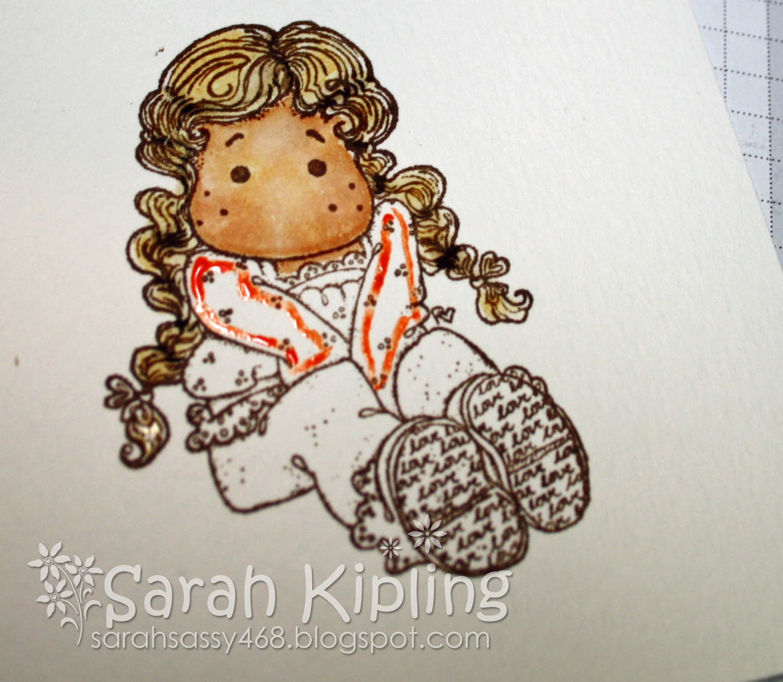
Grungy Tilda


Hello Stampers!

I've been playing with my watercolouring lately - getting more familiar with my distress inks as it's been a while and I'm teaching a class next month.  I also had picked up the Tim Holtz 8x8 collage paper pad, so this is what came together!  I always feel like darkening my distress inking.  I like to add lots of grey and black around the edges.  So the Tim Holtz grungy look came to mind.

I am loving the fact that Spring is in the air.  My daffodils are out - I just LOVE seeing my Spring bulbs bloom!  So I was inspired to colour this little summertime Tilda.

A fairly simple card.  I didn't feel like a lot of embellishments as I used a very intricate die (which I LOVE by the way!).  So Tilda stands alone here.

Happy Stamping!

Sarah
xx

Supplies:
Stamp:  Tilda with Summer Flower (Magnolia)
Ink:  Black Archival (Ranger)
Distress Inks:  Various (re-inkers)
Tools:  Tim Holtz watercolour brush
Paper:  Strathmore Watercolour Paper & Tim Holtz Paper Stash Collage
Die:  Garden Lattice Frame (Sizzix Thinlits) & Spellbinders Nestabilities Oval.


Apr 1, 2013

Uptown Girl Audrey - Courage


Hello Stampers!

I've been having a blast the last few weeks working in my art journal.  Now I'm trying to take some of those techniques and experiments and add them to my cards.  This is my first attempt - I had so much fun!

Supplies:
Paper:  Kraft cardstock, Copic X-Press It, UrbanTraveler 6x6 pad (Simple Stories)
Spray inks:  Mallard & Pink Bubblegum (Tattered Angels Glimmer Mist)
Other:  Self-adhesive pearls (coloured with Copic RV69), Tissue Tape (Tim Holtz)
Copics:  Face; E50, E11, E13.  Cheeks & Lips & Lipstick; R20, R22.  Eyeshadow;  BG11.  Hat & Shoes & Gloves; E30, E31.  Purse; YR20, YR21.  Bows; BG53, BG57.  Purse clasp & lipstick tube; C2.  Ground; W3.  Outline; BG10.  Dress; RV63, RV66, RV69.

Mar 25, 2013

Happy Easter Marci Bunny


Hello Stampers!

I am so happy that Spring is finally here and Easter is just around the corner.  I've been adding some spring colours to my house - and to my crafting as well.
Supplies
Ink:  Ink:  Memento Rich Cocoa (Tsukineko), VersaMagic Wheat Chalk Ink (Tsukineko).
Paper:  Copic X-Press It, White cardstock, Secret Garden 6x6 pad (Graphic 45)
Copics:  Face – E50, E11, E13, E15.  Lips & Cheeks – R20  Hair – E30, E31, E33, E35, E37, E39.  Bunny Suit – YR0000, YR000, YR00, YR01, YR02.  Ears, Tummy, Feet – R0000, R000, R00, R01.  Egg – YG03, Y00, V01.

Mar 18, 2013

Art Journaling


Hello Stampers!

Happy Monday!  Here in Ontario, March Break has just ended (boo!) and for my family that meant a sunny vacation.  So after a week of wonderful holiday, I was very excited to get back to some crafty business with my girlfriends!  Yay!

At our new "art journaling" class, to be held monthly, Lori & Kim walked us through some super fun techniques!  I completed two layouts and I'm pretty happy with how they turned out.  Plus it was a lot of fun to get inky!

If you're in the neighbourhood, look us up!

Supplies:
Journal:  Dylusions Journal
Ink:  Dylusions sprays in melted chocolatelemon zestvibrant turquoise.  Ranger Archival.
Tools:  Tim Holtz watercolour pens, Ranger mini-mister, white gel pen
Stamps:  Tim Holtz Mixed MediaJust ThoughtsTravel Blueprint


Jan 25, 2013

highlights from CHA - part 5

OK - saved the best til the last.

Yep - fully admit it - huge, crazy, weak-kneed fan of Tim Holtz!  I just love his style - and how he makes everything look so easy.  You cannot be around this guy and not feel like crafting!

Had to get my photo-op in of course!  He is always super, super gracious, no matter how many of us crazies are wanting photos & autographs!  Just lovely.  Have to say - this man is the demo master - he could sell anything!

Watching the man at work (again).  Yep - might have spent a little (lot) of time at the Ranger booth!  Here Tim is demonstrating his new Distress Paints which were (no surprise) one of the Top 20 products at CHA.  Of COURSE they are super cool and amazing and of COURSE I need them all - like yesterday.

Just one more pose - cause you know - I can!  Shoulda' taken a pic of Tim's shoes.  The man wears cool shoes.  But - that might have been just a tad stalker-ish...

The new paints.  LOVE.  You can layer them, unlike the distress inks.  They have no texture or grit once on the paper.  You can make them translucent or opaque.  Super cool.

Happy Crafting!

Sarah
xx 


Aug 27, 2012

Saturated Canary Autumn


Hello Stampers!

Hard to believe that summer is nearly over.  Back to school time is here!  This weekend has been all about school supplies and new shoes in my house.  My soon-to-be third grader is pretty excited!

This is my FIRST fall project of the year!  I wait as long as I can every year, because I love summer so much especially all the bright colours.

This little beauty is one of our brand new line, Saturated Canary, that we ordered at CHA Chicago.  This is "Autumn".  Isn't she sweet?  Those of us who took Suzanne Dean's Copic class on hair the other weekend had fun learning some techniques on these cute stamps.

She is stamped on XPress It with Memento ink in Rich Cocoa (my favourite!).

I've inked the edges with some Tim Holtz distress inks (old paper, frayed burlap, brushed corduroy) using the distress tool.  I've used my Viva Decor pearl pen in bronze to add some accents.

Happy Stamping!

Sarah
xx


May 22, 2012

Tutorial: Water colouring Magnolias with Distress Inks


Hello Stampers!

It was a beautiful Victoria Day long weekend here in London.  Unfortunately I didn't see much of it, as I was inside with a sick child.  But I took advantage of the time to write a little tutorial!

I will be teaching a class at SGD on May 31 where you can learn this technique in person!  In the meantime, here is a pictorial view.

First - here are my tips for starting out!

1.  I use the distress ink refills - but I have also enjoyed doing this technique with the distress markers!  They will do the same thing for you - with the advantage of being more portable, and less messy.

2.  I use the Tim Holtz palette - and I have a drop of refill in each spot - and line it up with my colour chart.  Having this colour chart in front of you is very important!

3.  I use a variety of brushes.  Mostly, the Tim Holtz detailer tip water brush.  I also use a number 0 paint brush and a number 00.  The Tim Holtz broad brush is also handy for backgrounds.

4.  I use watercolour paper.  There are MANY on the market.  I buy mine at an artists supply store and it is 140lb cold press.

5.  I stamp my image using Versafine ink, in Sepia.  I have also used Ranger Archival ink which works well too.  I like the sharp detail of the Versafine.

6.  I also keep beside me a pot of water, some paper towel, and my heat tool.  This Ranger heat tool is AWESOME.  I keep it plugged in beside me all the time.

OK - here we go!

Here is Tilda with Lovely Lace Shoes, stamped in Versafine Sepia - on watercolour paper.


First I colour all the skin.  With a damp brush, pick up some tea dye ink (or apply directly from the distress marker) around the face/ skin area.


Dab all the ink off your brush onto paper towel, and using a damp brush - blend out the ink into the skin area.


Here you can see the first coat of tea dye - almost completely blended out.  The first time you try this, you  may find it tricky - and may not like the result.  The nice thing is that you can add more water - and dab up the colour with a paper towel.  Just leave to try and then try again!

The key is knowing your brush - getting the feel for "how wet is just right" and how much ink you have on your brush.  Try it out on a scrap piece of paper before applying to your image to get the amount of ink just right.  Be sure your brush has no colour on it before you use it to blend out.  Be sure it isn't too wet.  If you go outside the line, use a damp brush to clean up the area - and push the ink back into the image.


Now I leave that base coat to dry a little and move onto the hair.  I apply some antique linen as a base coat for the hair.  Later I'll add some brushed corduroy and some scattered straw.  Also a little mustard seed for some brightness on the crown of her head.  You can use any of the browns that you like - or the light yellows - give them a try!


Now I go back and apply a second coat of tea dye to the face and blend it out.  I also apply little dots of tattered rose to the cheeks.


Then I go back to the hair, add some browns, and blend then out with some more antique linen.


Now, I apply some "dried marigold" to the shirt.

Here it is blended out.

Then, I finish up the blouse with "spiced marmalade".

I use some "spiced marmalade" to give shadows on the blouse.


For the jeans, I've used "faded jeans".

And also a little bit of "crushed olive" on the bum, to make them look "lived in" and worn.  I used "chipped sapphire" for the shadow areas.

I've also gone back and touched up the hair with some "vintage photo" around the hairline, and a little "mustard seed" on the crown.

I've used "brushed corduroy" for the soles of the shoes, and "dried marigold" for the frilly sock.

I've finished up the shoes with "antique linen".  I've used "weathered wood" for the outline and "brushed corduroy" for the shadow.  I've also overlaid some "brushed corduroy" on the shadows of the pants & the blouse.  I dabbed some "dried marigold" on the hair bows.

And here she is!


I hope you enjoyed my little pictorial.  Here are a few more little tips & tricks for you.

1.  use two colours per area, a light and a dark.  i.e. "dried marigold" and "spiced marmalade" or "faded jeans" with "chipped sapphire".

2.  use a brown shade to apply a deep shadow - here I've used "brushed corduroy" over the orange blouse and the blue jeans.

3.  give the base coat time to dry before applying the shadow for more depth.


Jan 29, 2012

Tim Holtz Valentines


Hello stampers!

I wanted to share two cards I made for an upcoming class that I'm teaching at Scrappin' Great Deals.  Kim & I are huge fans of Tim Holtz and are collaborating to teach as many techniques as we can fit into three hours, while making four Valentine's Day cards.

I'm pretty happy with how this first card turned out.  I used Tim's videos and Christmas tags as reference.  The butterfly is Kraft glassine, that I've sponged with alcohol inks, stamped with archival ink, then die cut, crumpled, distressed with Walnut, and adhered with the mini stapler.  The background is from the Paper Stash pad.  I've inked with Picket Fences stain, heat set, then added some pink stains, heat set again, then stamped with archival ink.  The bottom border is made with Kraft core.  I've embossed it with a folder, then sanded it, distressed it with several inks, sprayed with two colours of Glimmer Mist and added the long fasteners.  I've distressed them with the texture hammer.

Here's the second card:


Here I've used some Perfect Pearls, as well as tissue tape, and the rosette die (I LOVE this die!).

Happy Stamping!

Sarah
xx


Jan 25, 2012

MFT Tea Set Cards


Hello Stampers!

Here are a few of my favourite things:
- Tim Holtz distress inks
- MFT stamps & dies
- Kraft paper
- twine


This is a class I'm teaching at Scrappin' Great Deals on Feb. 4 using the My Favorite Things Always Time for Tea stamp & die set.  I love stamps with matching dies and this set has a fabulously versatile array!

MFT Die-namics Always Time for Tea Die & Stamp Set YSTMT

I've also used one of my favourite 6x6 paper pads, Little Black Dress, by Basic Grey.  This is one of those sets that I hoard preciously in preparation for when I can no longer buy it!  It has the most beautiful leopard print paper in it.  Too delicious for words!

Basic Grey Little Black Dress 6x6 Paper Pad 3494

Those of you in the know can probably tell that I took the "Clean & Simple Card Making" online class.  What a fanastic class!  I so enjoyed it.

Happy Stamping!
Sarah
xx