Pages

Sep 25, 2011

Prima Printery

ENABLER ALERT!

I have to warn you - that with this new line - it was Love at First Sight!

Welcome to the stunningly gorgeous world of Prima Printery! I feel like these designers must have gone into my head somehow and designed my perfect line of products. Please note that before I wrote this blog - I first went into the store and bought as many pieces as I could carry so as not to run out!


This was a commissioned card I made this weekend and quickly snapped a few photos before it went out the door.


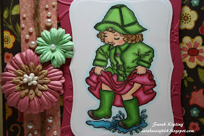
This is my perfect style. Old, European, French, Antiquey. I adore it! I've used several My Favorite Things (MFT) dies, as well as a favourite Spellbinders Nestabilities set. Aside from the adhesive and some Glimmermist (you can see the shimmer on the frame), the rest is 100% Prima Printery!

I've used the paper (I admit - full addiction to 6 x 6 paper pads), the jewels, and the stunning little tiles. About the only thing I didn't use (and that's because I forgot) is the gorgeous flowers!


Happy stamping!
Sarah
xx

Sep 22, 2011

High Hopes new release blog hop!

Welcome to stop # 8 of 11 on the High Hopes Christmas Release Blog Hop!

You should have come here from the talented Kristine (if not, feel free to go back and see her gorgeous creation!).

And your next visit will be to the lovely Alex!

This is the lovely new "Christmas Joy" snowman from High Hopes that will be available to purchase on Thursday!  Don't miss out on your order for one of these GORGEOUS new stamps!  I must admit that I really dragged my heels on getting out the Christmas crafting supplies this month.  Especially since I'm still wearing shorts and I HATE saying goodbye to summer every year :-(  BUT these cute little snowmen have helped "ease" me into the spirit!


If you've been following my posts this week leading up to the official release date, I am continuing with my colour scheme for my cards with the GORGEOUS new Bo Bunny Blitzen paper.  DEFINITELY my fave of the new Christmas papers so far!  A perfect match with Stampin' Up kraft paper.  I've added the coordinating cardstock stickers, and accented with a beautiful Prima flower I had left from last year, and some self-adhesive pearls.  Those who follow me know my love with the Spellbinders nestability dies, and this is one of my favourite, labels ten.

I've stamped my little snowman on Copic XPress It with Memento ink in Tuxedo black and coloured him with my Copics.  I always look for an opportunity to use some BG's!


Copic colours:  BG18, BG15, BG13, BG11, BG10, E55, E53, E51, R39, R37, R35, R32, W3, W1, W0, W00, YG17, YG25, YG03, YR12.

I am a proud member of the Scrappin' Great Deals design team, and I'll certainly be featuring these High Hopes stamps on my blog posts over there as they become available for sale.  Maybe I'll even teach with them this fall!  By the way - there is an AWESOME sale on over there right now.....


Save 25% on Spellbinders & Cuttlebug!!
This includes Grand Calibur, Cuttlebug Machine & sooo much more!!
(pre-orders & clearance are excluded from this offer)
plus ...
With every $25 purchase (pre-tax) you will receive a FREE bottle of Stickles!
No coupons necessary - discounts will automatically be applied
These special offers end Friday, September 23rd @ midnight
Offers cannot be combined with other discounts/coupons

Tell them Sarah sent you!

Carrying on to your next visit along the High Hopes new release blog hop - please visit Alex!  And when you get back to the High Hopes blog, don't forget to enter this week's challenge "Home for the Holidays".  You have another week to enter your submission - and win some awesome new stamps!!

Happy stamping!

Sarah
xx

Sep 21, 2011

High Hopes sneak peek - day 2!

Here's my creation for Day Two of the High Hopes Christmas release!

I am loving working with these stamps!  They are the prettiest Christmas stamps I've seen in a while, and so much more versatile than the usual ones I see.


I've continued my theme with the beautiful new Bo Bunny Blitzen paper.  I admit that I do have an addiction to 6x6 paper stacks - but this one is different - really!

I've stamped High Hopes Snowman with Bird on Copic XPress It with Memento Tuxedo Black ink.  And (of course) I've coloured him with Copics!


I punched him out with my Nesties Ovals and the background paper with the Nesties scalloped ovals - and pop dotted them.  I printed the sentiment myself on SU! Kraft paper, and punched it with my Nesties also.

I've added some gorgeous handmade crochet flowers that I found on Etsy, and added some accents with my Viva Decor pearl pen.

I'm also entering this card to the challenge for the brand new Touch Twin Markers by ShinHan!

Copic Colours: 
R39, R37, R35, R32; YR12; E79, E77, E74; YG17, YG25, YG03; B97, B95, B91; E55, E53, E51; W5, W3, W1, W0, W00; BG10.

I am having such a great time as a Guest Designer for High Hopes - only wish I could do this full time - now that would be a fun career!

DO NOT miss our awesome Blog Hop - tomorrow - Thursday, Sept. 22 - and also to see the full release of these beautiful stamps!

Hope you enjoyed this little sneak peek!

Happy Stamping
Sarah
xx

Sep 20, 2011

High Hopes new release and "Home for the Holidays" challenge!

Hello stampers!


I'm absolutely thrilled to be a guest designer for High Hopes stamps this fall!  And I think I got the BEST release ever to work with!  Just wait till you see these images - they are awesome.  It was really hard to choose which ones to work on for the release this week!


This week - please join us for two special events - our "Home for the Holidays" challenge as well as our brand new Christmas release and blog hop!


This little snowman is absolutely one of my new faves for the holidays.  With his string of hearts, he is SO PERFECT for Christmas!  He just shouts old fashioned family Christmas to me.  And as soon as I found these beautiful Bo Bunny Blitzen papers at Scrappin' Great Deals, I KNEW they would be a perfect match!  I love these old fashioned colours, and muted combinations for Christmas, compared to the very traditional, staid red & green. 


I had a great time colouring this guy with my beloved Copics.  I am 100% a Copic girl, and so High Hopes stamps are ideal for me!  They have nice open spaces to get some really good blending & shading and to really build up that colour.


Be sure to go to the High Hopes blog and see some more of these gorgeous new images!  They are guaranteed to put you in the Christmas spirit!

Stamp:  High Hopes Snowman with Heart String
Paper:  Bo Bunny Blitzen, Copic XPress It
Ink:  Memento Tuxedo Black, Tim Holtz for Ranger Antique Linen Distress Ink
Cardstock:  SU! Kraft
Dies:  MFT sentiment die, Spellbinders Nestabilities Lacey Hearts, Tim Holtz Alterations Brackets Edge Punch
Accessories:  SU! ribbon, Diamond Stickles, Sticky Thumb Adhesive, Tim Holtz blending tool
Copics:  E79, E77, E74, E71, R29, R27, R24, B97, B95, B93, B91, E15, E13, E02

Happy Stamping!
Sarah
xx

Sep 19, 2011

MFT Pure Innocence and Copics

Hello all!

VERY pleased to share this awesome deal with you! If you sign up this month at SGD, you can get 50% off any class of your choice in the month of October! What a great way to get back into the winter crafting season again! I'll be teaching two classes in October - Copic 101 on Oct. 12 and Intermediate Copics on Oct. 27.

I wanted to share with you the cards we'll be making at my October 27 Copic cardmaking class. These are the FIRST fall/ winter cards I've made this year. Phew, what a shock to the system! After such a beautiful summer, it was hard to say goodbye to my peach-coloured toes and my summer themed stamps!

These stamps are both from My Favourite Things Pure Innocence Line. I think they're cute as a button! They're very versatile images and come with several sentiments. AND, best of all, they are IDEAL for Copic colouring!

When starting with Copics, you want to choose images that aren't too "intricate" and have lots of nice open spaces so that you can get some nice blending and have room to work. Personally, I really like colouring little people as opposed to animals and scenes. So these stamps are some of my faves!

I also love High Hopes stamps - and I'm thrilled to be a guest designer for them this fall! We are just getting ready for the September release THIS WEEK! So be sure to check out my blog as well as the High Hopes blog to get a glimpse of the GORGEOUS new images which are happily on my craft table right now!

Copic Class - Oct. 27 - Card 1:
Stamp: My Favorite Things Pure Innocence You Color My World
Paper: Bo Bunny Back to Basics Forever Fall
Cardstock: Bazzill
Ink: Memento Tuxedo Black & Tim Holtz for Ranger Distress Ink in Antique Linen
Dies: Spellbinders Nestabilities Labels 8 and Sizzix Tags Scallop Combo #2
Copics: BG78, BG75, BG72, RV69, RV66, RV06, YR23, YR21, YR20, E01, E00, E000, R20, E33, E31, YR20, C4, C5, C1, BG10.
Copic Class - Oct. 27 - Card 2:
Stamp: My Favorite Things Pure Innocence Flurry of Love
Paper: Bo Bunny Back to Basics Blitzen Dot
Cardstock: Bazzill
Accessories: Bo Bunny Blitzen Dot Cardstock Stickers, Adhesive Pearls
Ink: Memento Tuxedo Black
Copics: R37, R35, R32, E01, E00, E000, R20, E33, E31, YR20, B97, B95, B93, G85, G82, G40, BG10, BG000.
If you are coming to a Copic cardmaking class at SGD, please bring your own Copics if you have them! We do not have all the colours and will only have full sets for the 101 class. Please also remember to bring your adhesive, scissors, and paper trimmer. THANK YOU!!

I would LOVE to hear from you about any suggestions for future classes! I'm thinking of running some special Copic technique classes including monochromatic, black & white, "look no lines", etc. Let me know what you'd like to see from us!

I'm submitting these cards to the challenge for the brand new Touch Twin Markers!  Check it out here

Happy Stamping!
Sarah
xx


Sep 12, 2011

fave Copic colour combos

I’ve had lots of questions lately about favourite or best Copic colour combos, so I thought I’d write something about my suggestions this week.

First of all, if you don’t already have it, I would suggest that you get the Copic colour swatch book. Because it is printed on Copic friendly paper, you can try out colour combos right beside your chart. I get my ideas mostly from reading blogs. When I see a card that I like, I’ll write down the colour combo and try it out myself. I always write down my Copic colours in my blog entries and I know many other crafters do as well. Sometimes I just experiment and find colours that blend nicely together, and I’ll add them to my swatch book.


In no particular order, here are some of my favourites with examples of where I’ve used them.

Pinks:

My favourite pinky pinks are R81, R83, R85. Here you can see them on the little girl’s shorts. These blend into a nice pink, not too peachy and not too red.


If you want to "spice it up" a bit, you can use the combination of R89, R85, R83, and RV02. The R89 brings in some nice deep shadows which I like, and the RV02 brings a brightness. I like the contrast which you can see in this image in the skirt:


Greens:

This image also shows one of my favourite green combos: YG67, G24, G21, YG06. Same as with the pinks, the YG06 brings a nice "brightness" to the combination, making it not as flat or dull a green as it would be otherwise.

Blues:


I love deep, rich blues with deep, rich shadows. This is a card I made a long time ago, and I might do it a little differently now, as my style has certainly evolved. But I still like the combination of these blues. I used B99, B97, B95, and B93. The B99 is a beautifully dark, rich blue which gives some great shadows.


Skin:

Skin is always a tough one, and always a personal prefernce. Some people like a dark skin tone, while others prefer a pale look. Personally, I like a nice contrast with some deep shadows and I use E11, E02, E01, E00, R20. You can see how the skin under her bangs is shadowed and a deeper tone, with her cheek which is out in the sun, is much "brighter".


Hair:

Another popular topic in Copic classes and always a personal preference as well. Real hair comes in an infinite array of colours, so the sky is the limit when colouring hair! There are some great manga artists out there who colour in blues, pinks, and purples too. My "go-to" choice for hair is E35, E31, YR20. Depending on how many times you layer, and how deeply you colour, they can look quite different each time. Here are two images where I've used the exact same colours for the hair and you can see how much darker the second one is.


I hope this gives you a few tips and ideas for your Copic colouring!

Happy stamping!
Sarah
xx


Sep 6, 2011

now designing for High Hopes stamps!

Happy Tuesday and Happy Back to School Day!
My baby is starting GRADE TWO today – I can hardly believe it!  Where did the last 7 years go?  Seriously!

I’m THRILLED to bits to be a new Guest Designer for High Hopes stamps!  I’ve loved this line of stamps for a long time, especially because they are perfect for Copic markers (my favourite medium).  So I’m looking forward to inking up many of their beautiful new release images once they arrive!  YAY!

I stamped this little guy for the “Back to School” theme over at High Hopes.  Be sure and enter the challenge for your chance to win 3 High Hopes stamps of your choice!!  What a great prize!!

 Also come and check us out at our new page on Facebook for lots more creative ideas!


I’ve stamped my little mouse on Copic Xpress It – and coloured him in Copics.  I’ve used Nestabilities Labels Eight in two of the sizes to create a frame as well as the Shapeabilities Butterflies die to create a two-layered dimensional butterfly.  This BEAUTIFUL paper was a perfect way to ease me into the fall mood, even though I hate to give up the summer.  I really am a summer girl – I have such a hard time with winter – ugh.  I’ve spritzed all my paper with Glimmer Mist in Dazzling Diamonds.  I just love the shimmery effect it gives.  I’ve added some gold Smooch to add extra oomph to the flower and some other flowers in the pattern.  I’ve used My Favorite Things rolled daisy die (I LOVE this) and found a coordinating brad in my stash to finish it off.


My background is on SU! Kraft - and I've used two SU! stamps in Tim Holtz for Ranger distress inks to create the setting for my little mouse.  Of course, I've added a little extra bling here and there with some Stickles and some 3D glaze on my little mouse.  I've typed my own sentiment which I found in this awesome book InspirationStation Book of Quotes/ Titles.

And if you're in the mood for a little enabling - check out my post on the Scrappin' Great Deals blog..
 Happy stamping!
Sarah
xx


Cardstock:  SU! Kraft & Early Espresso
Paper:  Copic Xpress It, Basic Grey pyrus
Spellbinders:  Labels Eight, Shapeabilities Butterflies
Other dies:  My Favourite Things Rolled Daisy die
Stamps:  High Hopes mouse under mushroom, Stampin’ Up Linen Background, Inspired by Nature.
Ink:  Tim Holtz Distress inks, Walnut stain, Frayed burlap, Antique linen
Copics:  E59, E57, E55, E53.  E13, E11, E02, E01, R22.  E44, E43, E2, E41.  R29, R27, R24, R22, YR23, BG78, BG75, BG72.  BG02.  YG99, YG97, YG95, G40.  BG10.
Accessories:  Glimmer Mist, Crystal Stickles, 3D Crystal Lacquer, Gold Smooch, Sticky thumb adhesive roller & dimensionals, SU! Dimensionals, Tim Holtz blending tool


Sep 2, 2011

fun with MFT dies

This card was just for fun!  Not for a challenge, or design team, or custom order, or anything other than for me!  What a thrill!

I LOVE MFT dies - they are just some of the best in the business honestly!  Now, the rolled flowers did have me stumped for a while, but many YouTube views later, I think I have at least a start at it!


I've used "Own Your Story" stamp set & die combo here which I just ordered last month.  I think it's just a beautiful and versatile set.  I love it!  And how strange for me - a card with no coloring!  Imagine!

I wanted to use all muted, neutral tones here to coordinate with this beautiful Bo Bunny et cetera paper, and to show off the dies really.  I've also used quite a bit of Tim Holtz for Ranger distress ink with the ink tool, which I don't usually reach for.  So this card was quite out of my ordinary style!

I've coordinated with some Stampin' Up cardstock in Kraft and Chocolate Chip, and I've used the Memento ink in both Tuxedo Black and Rich Cocoa.   I LOVE stamping on designer paper - think it just looks so nice.  And the stamps in this set are really versatile - they went so well with this Bo Bunny paper.


I've been trying to figure out this rolled rose die for a while now, and the right material to use with it.  Finally I found some felt that worked just right.  I did try with the Tim Holtz grunge paper, but I just found it too thick and rigid to work with.  Practice makes perfect I hope!


The distress inks I used were Antique Linen and Victorian Velvet.  I've used my beloved Viva Pearl Pen (how did I live without this thing?), some gold smooch, 3D crystal lacquer, and crystal Stickles.  Can NEVER have enough bling!

Happy Stamping!

Sarah
xx