I’ve had lots of questions lately about favourite or best Copic colour combos, so I thought I’d write something about my suggestions this week.
First of all, if you don’t already have it, I would suggest that you get the Copic colour swatch book. Because it is printed on Copic friendly paper, you can try out colour combos right beside your chart. I get my ideas mostly from reading blogs. When I see a card that I like, I’ll write down the colour combo and try it out myself. I always write down my Copic colours in my blog entries and I know many other crafters do as well. Sometimes I just experiment and find colours that blend nicely together, and I’ll add them to my swatch book.
In no particular order, here are some of my favourites with examples of where I’ve used them.

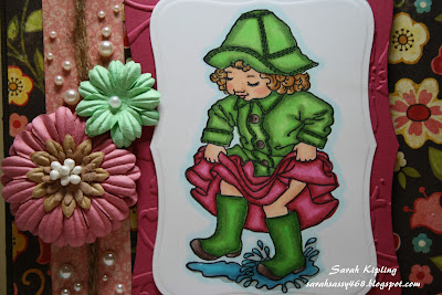
If you want to "spice it up" a bit, you can use the combination of R89, R85, R83, and RV02. The R89 brings in some nice deep shadows which I like, and the RV02 brings a brightness. I like the contrast which you can see in this image in the skirt:
Greens:
This image also shows one of my favourite green combos: YG67, G24, G21, YG06. Same as with the pinks, the YG06 brings a nice "brightness" to the combination, making it not as flat or dull a green as it would be otherwise.
Blues:

Skin:
Skin is always a tough one, and always a personal prefernce. Some people like a dark skin tone, while others prefer a pale look. Personally, I like a nice contrast with some deep shadows and I use E11, E02, E01, E00, R20. You can see how the skin under her bangs is shadowed and a deeper tone, with her cheek which is out in the sun, is much "brighter".


really enjoyed reading that thank you
ReplyDelete